
How to Choose the Right Paint Colors for Your Home
Choosing the perfect paint color for your home can be both exciting and overwhelming. The right color can transform a space, create the mood you desire, and even increase your home’s value. With so many shades and finishes available, how do you make the best choice? This guide will help you select the perfect paint colors for each room in your home.
1. Consider the Mood of the Room
Different colors evoke different emotions, so think about how you want to feel in each space.
- Calm & Relaxing – Soft blues, greens, and neutral tones work well in bedrooms and bathrooms.
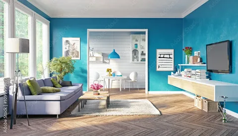
- Energizing & Stimulating – Bold reds, oranges, and yellows add excitement to kitchens or workout spaces.
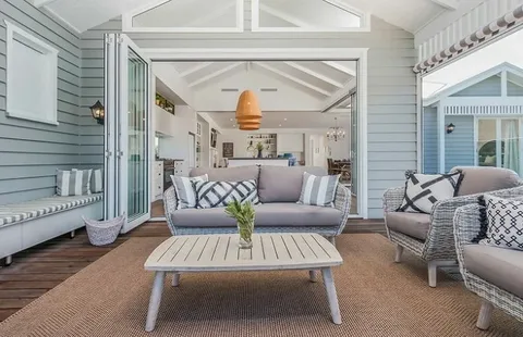
- Warm & Cozy – Earthy tones like beige, taupe, and terracotta make living rooms feel inviting.
- Sophisticated & Modern – Grays, blacks, and deep jewel tones add elegance to dining rooms and offices.
2. Get Inspired by Your Home’s Style
Your home’s architecture, furniture, and decor should complement your paint choices.
- Modern Homes – Neutral colors, grays, and monochromatic schemes work best.
- Farmhouse Style – Soft whites, warm beiges, and muted greens or blues fit beautifully.
- Bohemian Vibes – Earthy tones, rich jewel colors, and layered textures create depth.
- Minimalist Spaces – Crisp whites, muted pastels, or cool grays enhance simplicity.
3. Test Colors with Paint Samples
Before committing to a color, test a few samples on your walls.
How to Test:
✔️ Paint a small section of your wall and observe it at different times of the day.
✔️ Check how the color looks under natural and artificial lighting.
✔️ Compare the sample next to furniture, flooring, and decor.
✔️ Consider using peel-and-stick paint samples for a mess-free option.
4. Understand Undertones
Paint colors have subtle undertones that can affect how they appear.
- Warm Undertones – Hints of yellow, red, or orange create a cozy, inviting feel.
- Cool Undertones – Hints of blue, green, or violet offer a crisp, refreshing look.
- Neutral Undertones – Balanced hues that work well with almost any decor style.
Tip: Hold a white sheet of paper next to a paint sample to help reveal its undertone.
5. Coordinate with Existing Elements
Your walls should complement existing features like flooring, countertops, and furniture.
Matching Tips:
✔️ If your home has warm wood floors, choose warm-toned paint for harmony.
✔️ Cool-colored furniture pairs well with cool-toned walls.
✔️ White trim and moldings look great with almost any color.
6. Consider Lighting Conditions
Lighting dramatically affects how a paint color looks in a room.
- Natural Light – Enhances colors but changes throughout the day.
- Warm Artificial Light – Adds a yellowish tint, making cool colors appear warmer.
- Cool Artificial Light – Brightens cooler colors but can wash out warm tones.
Tip: If a room gets limited natural light, opt for lighter shades to make it feel more open and bright.
7. Use the 60-30-10 Rule
A balanced color scheme creates a harmonious look.
🎨 60% – Dominant color (walls)
🎨 30% – Secondary color (furniture, curtains)
🎨 10% – Accent color (decor, pillows, artwork)
For example, in a neutral living room:
- 60% Light gray walls
- 30% Dark gray sofa and curtains
- 10% Yellow throw pillows and artwork
8. Don’t Be Afraid to Go Bold

Accent walls or bold colors can add personality to your space.
🎨 Dark Colors – Create drama and coziness, especially in bedrooms or dining rooms.
🎨 Bright Colors – Energize a space, perfect for entryways or playrooms.
🎨 Contrasting Colors – Add depth and interest (e.g., navy blue walls with white trim).
If you’re unsure, start with a bold color in a smaller space like a bathroom or hallway.
9. Stick to a Cohesive Color Palette
For a seamless flow between rooms, choose colors that complement each other.
🎨 Monochromatic Scheme – Different shades of the same color (e.g., light gray, medium gray, dark gray).
🎨 Analogous Scheme – Colors next to each other on the color wheel (e.g., blue, teal, green).
🎨 Complementary Scheme – Opposing colors for contrast (e.g., blue and orange, red and green).
10. Trust Your Instincts & Have Fun!
At the end of the day, your home should reflect your personal style. While guidelines can help, trust your taste and choose colors that make you happy.
Final Thoughts
Selecting the right paint colors for your home doesn’t have to be complicated. By considering mood, lighting, existing decor, and color harmony, you can create a space that looks beautiful and feels just right.
Ready to start painting? Grab some samples and get creative! 🎨🏡